Monday, 5 December 2011
Creating my front cover
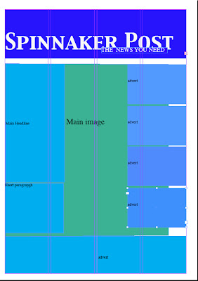
Now using my flat plan as a basis template for the production of my newspaper. I have ensured that it looks neat and professional by using columns and margins to correct sizes and angles of that which a professional newspaper follows. By doing this I am following newspaper convention, with a correct layout.
To ensure that my main image can be more prominent, I have used 4 columns, instead of 3. Making other front cover newspaper additions such as; competitions, adverts and writing smaller and the main image larger will connect to my target audience more efficiently. Following this tabloid like role, my audience will be more attractive to a large image and headline rather then more writing.
Making the newspaper front cover look even more neat, I have lined up all the information and image layout along side the margins and columns.
I showed this to members of my class and members of southdowns college to gain an insight into what I need to include and what I shouldn't include. This audience feed back will help me into creating my newspaper.
extra addition images for my newspaper
Here are some pictures I took which I could use for advertisement, competition and 'whats inside stories' - From vague pictures like these I will be able to create a local story, which my target audience in the proximity of Portsmouth could relate too.
Subscribe to:
Comments (Atom)


