Friday, 30 March 2012

Evaluation - How did you use new media technologies in the construct and research, planning and evaluation stages?

Throughout my research I used a range of different sources to gain insight and knowledge into how to create my newspaper and website and poster.
My first form of research was direct, direct to the newspapers. I brought 'TheNews' and other local newspapers, I was also provided them at college, I read through these, discussed the conventions of the newspaper with my classmates, these all followed the same columns, margin, imagery and type of story, such as human interest related to the proximity of the newspapers audience.
My second form of research came from the internet. Before working on all my media texts, I googled "local newspapers" "local newspaper posters" and "local newspaper websites" these all gave me insights into the widerange of of newspapers up and down the country, what they have in common and what conventions each one follows and to look into these to see what one will be more appropriate for my projects. By researching through local websites, I gained knowledge and information on the layout and how they used synergy and human interest in their stories. Information on politics was occasionaly included, but most didn't have a political bias. Due to this, I didn't include any political information to ensure that I am neautral to all members of my target auidence. By having this knowledge before  I started my newspaper, poster and website, I was able to include synergy and keep to the same theme throughout.

In planning my newspaper, I firstly created a flat plan. By creating a flat plan I have a basis of how to make my newspaper and I am able to gain comments from memebers of southdowns college of what I need to include and what I didn't need to inlcude.


Both of these fonts and texts reseach helped me plan for my overall theme of fonts and to include this in my newspaper, website and poster. I made my final decision after the comments made for imporvements etc, for my newspaper.

This is my flat plan, this was designed through word, by adding coloured blocks and writting over it, it allows me to have a basic understanding of how to lay out my newspaper after looking through the conventions of other newspapers.

Word allowed me to use simple tools such as text boxes, shapes and to fill with colour. Easy to create a flat plan not too complecated but enough detail to give my classmates a chance to see what I will be making.


Flickr


Flickr has allowed me to gather up all my images taken on my phone and put them in one place to they are easy to view. This creates an ease of access that they are all in one place and groups them together as a seperate group of images and seperate to my digital images taken.


Here you can see how they have all grouped together, this photostream is presenting all of my images taken from my phone and put together in a group. here you're able to access all the images and follow up the process of my development into the production of my newspaper, website and poster.   

Evaluation - How did you use new media technologies in the construct and research, planning and evaluation stages?

IWeb

I used an apple mac program called IWeb, IWeb allows you to create a website using all the suitable functions you need. As I needed to make two pages, It also allowed me to create I direct link between the two pages.

Before I started creating my website, I did some research on some other local newspapers websites to see the conventions they follow and how they create a synergy between their website and their newspaper. I found out that both the websites and the newspapers shared the same newstories and advertisement. I used this knowledge to my advantage and I included the adverts and stories of my newspaper to my website, to create a synergy so my target audience and go to both media forms for more information on the story.
Below you can see both my website home page and my newspaper front cover and page two, and the stories and adverts which have been included in both.


The story on Peter has been inluded on both my page two and my website, this form of synergy can allow this story to be published and read by more people in portsmouth and shows a direct link for my audience who can have more information on the news.
On the front cover of my newspaper, I have my main story of a local sop being closed down, this was also included on my website of news stories but I used a seperate image to show they are different stories but on the same thing.

With advertisement, I also found out that 'TheNews' include the adverts on their newspaper as well as on their website. In fact, they have more adverts on their website than on their newspaper. I followed this convention by include synergy by adding the same advert on my website but with different imagery and text but both advertising the same thing. Even though it is a large advertisment on my home page, This challenges the conventions of a newspaper website by not having more than one in the right third layout of the website.
Most local newspaper websites have a banner of advertisment across the top of the page, this is what I also included into my website. I again used synergy between my newspaper and website by included the advert used on my front cover to my website top banner.

As you can see by looking at my home page, the menu  consists of 'news, sport' lifestyle, community and contact us' these are pages which I also found during research as the most common pages to have a on local newspaper website. as you can see on the image below from 'The News' they use the same pages whithin the menu -


Research and planning for my website found me back here, the news are very successful and layout there website in a way which is used regually by people from portsmouth, which is the same target audience as me. I follwed their conventions of layout with adverts, newstories, menu, search bar, and also the chance to be a member with a 'log in' page which makes my audience feel more part of my newspaper.

IWeb allowed me to acomplish this by, having a structured and layed out page which allowed me to have accurate margins and space relevant to start off my website.


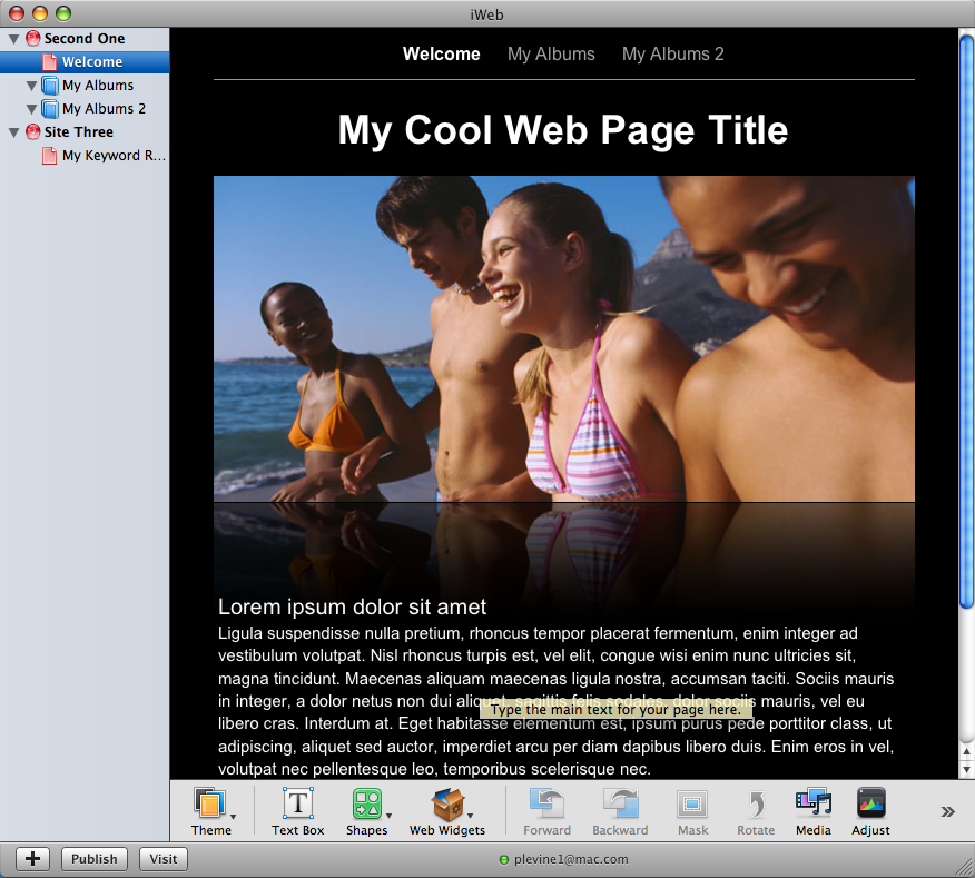
This is the default page which is presented to you before you can work, you're able to delete what they have given you and you're also able to add, themes, texts boxs, shapes, web widgets use media and adjust imagery and video clips. This allowed me to create a professional website and helped me follow the conventions of other local newspaper websites

Evaluation - How did you use new media technologies in the construct and research, planning and evaluation stages?

Phone

Throughout the development of my newspaper, I needed to take some images, These were taken on my phone. This portable form of media was the best option for me as I do not own a digital camera. My phone is a blackberry, and Blackberry's dont have the best pixels for the use of a high quality photo, this is the reason why some of my images are blurred.

As you can see, this is an image for the Spinnaker tower, one of the images I took hoping to use it within my newspaper. As you can see, from the refletion of the light, it reduce the accuracy of quality which is needed within a newspaper. I then foud due to this, I was unable to use this in my newspaper.


I then had to borrow the colleges digital camera and also use my friends camera, to ensure that my newspaper contained high quality detailed images which is used within most media forms.
After having access to high quality images, I then used these images to encorporate all into my website, newspaper and poster. Throughout planning my all my media forms, I gained opinions from my classmates and of my own, and all approved of my digital camera rather than my phone images, which was then all used in my contruction.
I went down to portsmouth, which is in the proximity of my target audience and I took images which my audience will be able to understand and relate too as they live there themselves. This image, along side my other images, were taken down commercial road. therefore, the images taken even the one you can see below which was used for my front cover -


This photo was taken by using a digital camea so it sustained the quality needed to be a front page image.
I then put this image through photoshop to make it more specific to my story so it isn't related to 'TheNews' which relates me to my next point.


Photoshop

I used photoshop in the construction of my newspaper to ensure that the images I have used are specific to the story, and also show an element of quality and I can make the image show what I want it to show.
Photoshop is key to making your media product high quality and so that there are no underlying misperfections within the mese en scen of the image and that the main point being made from the image is being shown and no background setting or lighting is effecting this


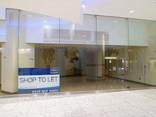
Here is the tools which I would use whilst editing images that I took with my digital camera. One of the most common for of tool that I used when using photoshop was the 'magic brush tool' this tool help you replace one colour with the same image from behind and you're able to stretch the colour along to cover-up any imperfections. One of the images which consisted of this tool through editing was my front page image.
This image, even though is high quality, have blured light and the flash of the camera at night meant that the room behind the glass is shown. This was then removed by using this tool, and then rotated to me made fit for my front cover.


After developing my image, I removed all the lettering by dragging the 'white colour of the paper' across the previous lettering and the added my own lettering on top, this meant that I can evolve my story around my image which has been made specific to the story. I then removed all of the flashed imagery from the backround room on the ceiling so it does not distract the audience from the main image, but I left some background ambience to imcrease the reality of my image. I then placed "50% off all carlsberg!" on the bottom banner to show that there was once a previous promotion which th shop was advertising.


This was anothing image that I planned to develop in the hope that this would be able to appear in my Newspaper, but due to the quality of the image, I disgregarded this as a plausible image to use. So with the help of photoshop, I intended to work with the blured image to give it an authentic and modern look


As I was trying out ideas to make this more ultra-modern in relation to the representation of Gunwharf, I filtered this image through stylize and glowing edges.

I have decided to edit this further to create a more identified image of this as this is too dark and wasn't what I intended.

Throughout my development of filtered images through photoshop I have decided I have to emphasize the bright colours involved as the dark image can be blurred and unidentifiable

Before I chose the correct 'couple image' for my valentines day advert - I took a picture of one female, this image was bland and boring, so I felt I had to remove the plain background and replace it with red. The reason for this is because red gives the audience the connotations of love, passion, relationships and also valentines day. below you can see the development process I went through with photoshop to create this image.


By using photoshop I was alble to create professional style images which will be appropriate on my newspaper, website and poster.
Evaluation - How did you use new media technologies in the construct and research, planning and evaluation stages?

InDesign
To create media products which mimic current media products, in this case, TheNews and any other local newspaper companies. The news produce, newspapers, posters and websites, which I will use to help create the same forms of media to ensure my products show an element of convention and to make it look professional and interest my target audience. The best way to achieve this is to use programmes which use effective tool and which can give me a perfect final finish. One programme which I used was InDesign. InDesign is a programme which allows you to use all the tools which can give you a final professional finish. Margins, columns, rows - all these tools allow you to have an evenly constructed front page and page two which can follow the layout and conventions of other media products.
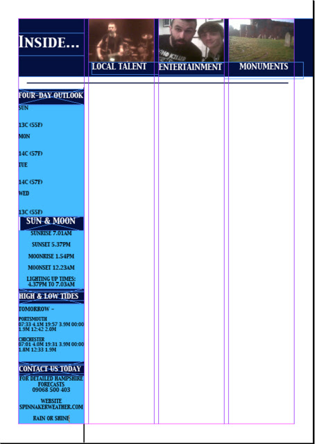
As you can see, this screenshot on InDesign shows you how margins and columns can be used to create and evenly spread page which will represent itself as a modern local newspaper. By having these columns and accurate margins I will be able to place texts from stories, imagery and adverts in the correct place to follow the conventions of other local newspapers and so my target audience will be able to read it with ease.


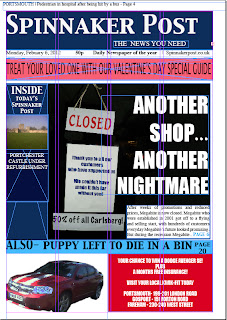
By using the columns and margins I was able to create this, my final front cover, and this helped me to organise where my imagery and text should be placed so my audience can naturally make the link with image with its caption and text


Throughout development of my second page, I used the columns and margins from InDesign to help me create and organised page. Weather and contacts on the left - main image at the top and the space left in the columns will be where my story will go.


As you can see, with the columns now removed I am able to create a neat and conventional page two which my target audience will be able to read in the conventional reading style of a newspaper.


Along side TheNews local newspaper we see that their page two follows the conventions of margins and columns, by researching this amongst other local newspapers, I was able to encorporate this into my newspaper to present 'Spinnaker News' as a conventional, professional local newspaper.

Final contact page page 2 website